
Helping people get started with our digital products
Getting Started Assessment
Activities
Design owner for the product team
Facilitated customer usability sessions
Prioritized user feedback into actionable updates
Ran discovery sessions with the team
Created personas based on top use cases
Designed high fidelity mock ups
Partnered with engineering to build assessment
Built cross-team relationships for cross selling within the assessment
My role
Creative Director (UX)
Design Lead
Overview
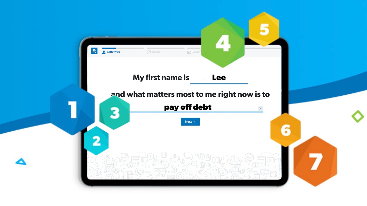
When you share a website with 15 different business units, agreeing on a main CTA is almost impossible. The top right “get started” button works for a singular product, but when people are coming to your site at all different financial levels, and needing help ranging from budgeting, saving for retirement, selling their home to creating a will or advice on how to leave a family legacy– it’s hard to point them to one place. The Getting Started Assessment was created from many customers saying, “they didn’t know where to start”. This quick, human-centered form approach to onboarding prospects collected data and gave them a custom plan on how to best use all the various Ramsey-branded tools; created just for them. It also allowed us to follow up via email and continue to coach them through the best next steps based on what goals they wanted to achieve.
Goal
Create a way for people to get started with our life-changing tools and products based on where they were in their financial journey and what goals mattered most to them.
Start with customer feedback (always)
We found fans and prospects that came from many different walks of life and interviewed them 1:1 while the product team listened and captured feedback. These first 25 interviews became the start of how we grouped customers into personas. By clearly defining these, we were able to begin thinking about what type of custom plans we’d need to create and what mattered most to them.

Make it as human as possible
Through user testing prototypes, one version with over-sized form fields kept winning. Customers loved the approachable feel and we could spread out asking for information in bite-sized pieces.

Change language based on feeling
We found through interviews that how you “feel” about your money situation is a huge factor. By adding a simple emoji question, we were able to create different ways to speak to the user (or what social proof we showed next) based on what they selected here. Uncertain? Here are people that succeeded. Frustrated? Headline copy could move up the dial on the motivation and empathy.

Adding motivation to the flow
Based on goals, feelings and numbers entered into the assessment, we were able to load in relevant interstitials that kept it feeling human and showed them other people that were trying to do exactly the same thing.
Data was key to the logic
Listening to the answers people gave and making sure that aligned to the right custom plan was very important. We continued testing and refining the way we asked questions and the way we delivered advice continuously over a 3 month period. Once we were confident in the content and how we were serving it up, the way the data was used became a huge focus. The logic of this assessment really pulled together all the advice given through our courses and fed back the appropriate starting place.
The most exciting part was having so much authentic data about a specific user made it so easy to find ways to offer them relevant messaging as we led them to the next step based on what they told us about their financial situation and goals. For example, if you’re “having trouble paying your bills” we are not going to serve up ads or emails about finding a real estate agent or investing, but rather tips on how to save money or budget. We saw conversions through email increase up to 40% in some cases on CTR by just using relevant data to market the right life changing products.

Results that don’t disappoint
Once you finished the assessment you are sent directly to your custom results page. The page showed them where they were on the baby steps plan (the company’s flagship advice for getting out of debt and building wealth), but acclimated them to it by providing “Your Areas of Focus” that spoke directly to each piece of information the user submitted. By using a mixture of advice, content and calls to action the user could see exactly what to start on next and how to engage with the various tools offered by the company.
The bottom part of the page was a dynamic ad that changed based on where the user landed on the plan. If they had debt, it shows how to sign up for a financial university set of courses– if they were trying to build wealth or invest, it sent them to find a pro in that area.
The way everything ran off of data and logic made it the perfect global CTA to sit at the top right of most website pages as no matter who the prospect was, they could fill out the assessment and within minutes be served up a relevant CTA and added to an email series that nurtured them further with content and social proof to take the next step.

All of our products won
We had so much data to use it how we served up recommendations, content and our digital product offerings. It was so cool to create a product that helped sell all of our products to new prospects. Whether a budgeting app or lessons on how to get out of debt– every business unit supported the assessment and “Get Started” CTA because it brought them more relevant prospects than ever before.
Optimizing for mobile
We knew from testing that the majority of users were coming to us on desktop but post-release, the data suggested the highest completion rates were on mobile. The experience was designed for both, but an audit and usability tests gave us plenty to improve upon. After customer sessions and auditing internally, we were able to make changes that moved the completion rate up to 75% for mobile users.


Data collected per submission
This was the first global tool for the company and we wanted to make sure we were storing and using all the data we collected. For every piece there was a place in the results that clearly utilized the data given. People told us over and over, I’ll give you information but I want to know how it is used– and we listened.

Overall performance post-launch
Once through Beta, we were able to keep the completion rate at 75% which is really high for an assessment with many questions. Another win was how many people opted-in to the company newsletter (over 20,000 per month!). This was a big milestone as that meant we’d continue being able to custom-fit messaging and offers based on where they were in their plan.
Additional screens


⚡️ Team credits:
Elizabeth Weeks (Product Designer), Casey Walton (Marketing Designer), Rachel Bshero (Content Manager), Bobby Tate (Software Engineer), Sean Byrd (Software Engineer), Jeffrey McFarland (Software Engineer)
In Conclusion
This was one of the most fun products to build because of 2 reasons. 1) There were so many fans/prospects to interview that it made testing & interviewing really fun. It also gave so much confidence to the refinements we made as we iterated and improved upon the initial release. 2) Being able to partner with every business and team in the organization led to strong cross-team relationships that would not have happened designing this experience for only 1 of the 15 businesses at the company. I really fell in love with talking to customers on this project and finding ways to bring humanity into a form experience.